3D renderings used for architectural visualization actually have a common goal with video games: creating a “world” that is consistent and convincing. In the case of using these 3D renderings to “sell” a property, the viewer should want to inhabit this world as well. To create a world convincing enough for the viewer to inhabit, adding details is the key. These details help the viewer see themselves inhabiting the world by giving it a “lived-in” quality.
There are two types of details you can add to the renderings.
1. Life Accessories

Let’s use purpose-built student housing as an example. Unsurprisingly, prospective residents for student housing properties are college students. They make up the target market together with their parents, who foot the bill.
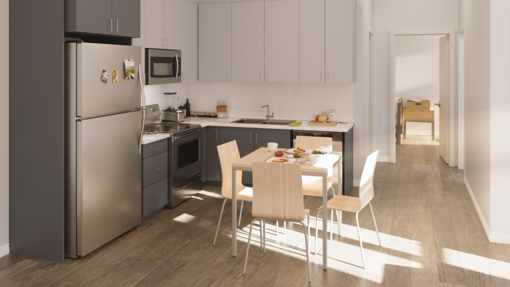
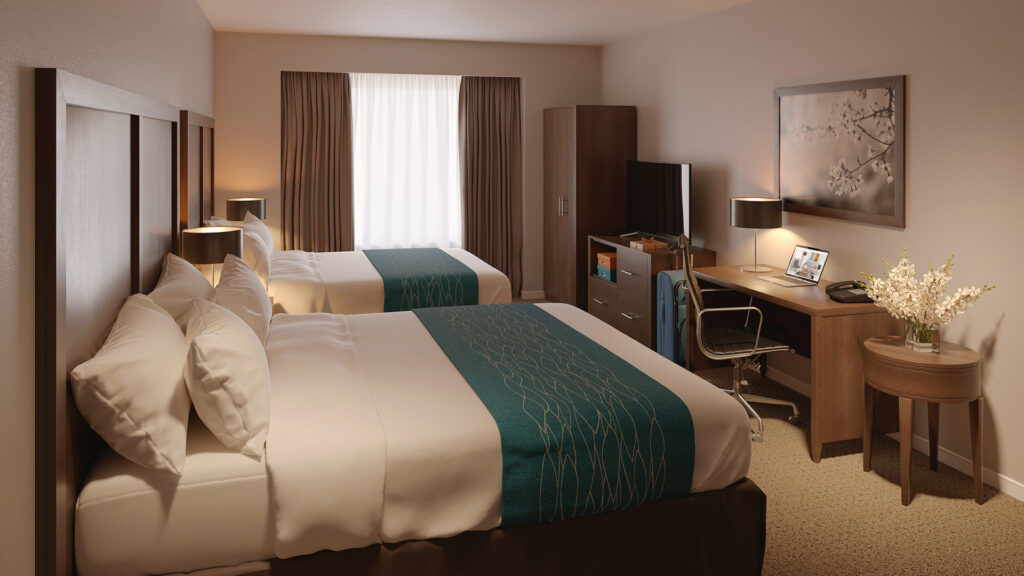
3D renderings for student housing, therefore, need to blend the property’s features – ensuite bathrooms, study lounges, gyms, etc. – with helping students feel like they could live there. Details you’d add would be items that are essential or familiar to Gen Z: mobile phones, laptops, textbooks, yoga mats. Place these items in spaces where you’d normally find them: textbooks in the study lounge, laptops on the bedroom table, pictures on the fridge, etc.
These items add a liveliness and warmth while showing off the intended function of the space. To spruce up a kitchen scene, we once put some avocado toast in mid-prep on the dining table – it has the bonus of adding a splash of color too. Be careful not to go overboard, though. Keep surfaces from being too cluttered and make sure the accessories you add make sense in context.
2. Imperfections

Imagine a living room with a leather sofa. It’s very likely that the leather will be wrinkled, or a little dented in some spots. Even a brand new sofa will still have some wrinkles around the edges. In a common space like the gym, the yoga mats may not be perfectly stacked. These little aspects together signal that humans live in these spaces, have just vacated them, and could be coming back at any moment. You may not register these imperfections consciously, but the opposite – complete perfection or uniformity – is difficult to ignore. You know that what you’re seeing is manufactured. This artificial feeling presents a barrier that you, as a viewer, need to overcome and actively imagine yourself living in the space.
3D Renderings are artificial – they are manufactured, by definition. To help create the illusion of realism, all of these imperfections must be added. That means every wrinkle has to be put there deliberately by the artists. Usually, when a piece of furniture in a rendering doesn’t “look right,” it is missing these imperfections. For fabric and leather, there should be wrinkles around the edges, and the edges should not be perfectly straight. For hardwood finishes, the surface of the wood should be slightly bumpy and not perfectly smooth. When you can’t put your finger on what’s “not right,” search for references on the material and look for the differences between the surface and edges.
To create the illusion of realism in spaces, the furniture and accessories should not be perfectly arranged. One of the countertop stools is slightly angled away. One of the throw pillows is not sitting against the back of the sofa. The house keys are casually tossed on the kitchen counter near the entrance. Even if you prefer a “staged” look, these imperfections can be strategically deployed to draw the eye towards something you want the viewer to notice.
These two techniques – adding life accessories and imperfections – should be applied with care. Having too many accessories will make the rendering look cluttered, and too many imperfections will make the space look messy. Perhaps most importantly, the accessories and imperfections should fit the target market. It’s not likely that a student would have a wardrobe full of business attire, for example.
Interested in renderings that fit your strategy? Drop us a line!

